Is Safari 4’s Bad Tab Design a Clue to an Apple Netbook?
Last week Apple released a beta of Safari 4. Immediately userland was polarized over one significant change: the tab bar had been moved up and replaced the title bar. If this was indeed to save 25 pixels vertically, as most speculate, it makes no sense as we all have such large screens nowadays. However, what if it's Apple planning for smaller screens, and in particular, an Apple netbook?
Many people say they like the tab bar at the top of the window, many others despise it. Myself, I'm in the latter category, I loathe it. I tried it for a few days and couldn't grow to like it by any measurement. It is visually confusing and butt ugly - fugly in fact. If this is the sort of thing Apple is going to do during Steve's absence, it can't get him back fast enough.
MacOSXHints.com has a poll and 55% of people prefer Safari 3 style tabs. (Which just goes to show that 45% of Safari 4 users will like anything Apple does.)
It's been said this is like what Google did with its Chrome browser. Chrome, however, does not break the boundaries of the containing window. That's not to say I like Chrome, but it is certainly a better implementation of the "tabs at the top" philosophy.
Both apps are functionally wrong, though. In Safari 3, Firefox 3 et al, the tabs are directly connected to the page - like tabs on physical pages. So the metaphor is consistent. It also makes changing pages very quick, as you only have to go to the top of the page to change the page. Very efficient and logical.
With Safari 4 you go outside the page, over the bookmarks bar, over the toolbar, and finally to the title bar to change the page. It's a little thing, but in the few days I tried to persevere with fugly tabs, it was noticeably irritating.
Visually, it's very untidy and confusing. A window is a self contained unit. It can contain other units, but that is it, they are contained within its boundaries. Consequequently, when using a window, you can clearly see where its borders are, there's no confusion with surrouding objects. Safari 4's tabs blow that away. There is no clear upper boundary, no fence. Consequently the eye becomes very confused because of that lack of a clear border. The visual clutter grows. This image is actually two different windows, despite how it looks
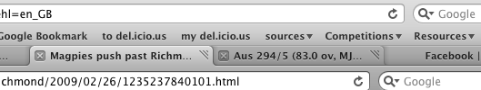
But maybe worst of all, when you have more than a few tabs open, the window titles get cut off, as you can also see in that image above.
No, wait, actually, worst of all is it creates an inconsistency with other applications and design in OS X. Unless. . . is this what Finder in Snow Leopard will be like? Please, Steve, no!
Furthermore, the colors are back to front. The selected tab is the same color as unselected windows. And the unselected tabs are the same color as the selected window. Hence further visual confusion with any windows below.
There is enough visual confusion as it is in OS X with the subtle variations in the greys of the front and back windows. And now Safari 4's fugly tabs make it even worse.
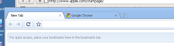
And, getting back to Chrome, it's a furphy that Safari 4's tabs are like Google's Chrome. Chrome still has the window bounding box and the tabs are contained within the window, as this image shows (and even if that pale blue was grey, there's enough space to not cause confusion with the window below):
Now, some of these points, such as the color confusion, will be fixed, as this is just beta. But there's no doubt the tabs in the title bar is here to stay, although I would hope Apple provides the option to disable it in the preferences.
So, after all that, after my arguments about why the tabs at the top are so wrong, Apple has still done it and will likely still do it in the final release. But why? As they say, if it ain't broke, don't fix it. The majority weren't calling for this, and in fact as that MacOSXHints poll shows, the majority still want it the old way. The tabs weren't broke.
Surely, with our mega-sized screens, we haven't become so addicted to space that we are so desperate for vertical real estate that 25 more pixels has us rejoicing in the streets, even though it sacrifices aesthetics? I hope the answer is no.
However, if you were on a 7" to 10" MacNetBook I can fully understand you saying yes. And for that reason it makes me wonder if this is the strongest clue yet that Apple is planning to release a netbook.
 del.icio.us
 Digg
Digg Facebook
 Slashdot
 StumbleUpon

Comments
Nobody is forcing you to upgrade. The current version works great. Is cover flow that useful in a browser anyway? Maybe the final version will either be different, or will offer a preference setting to have the tabs on top or on the bottom.
I like it.
Actually, Flyboybob, a major problem I had with Safari before v.3 was that Apple would only add features with a new version, which was bundled with a new OS. Since features were just skipped in earlier versions, I had designers working in 10.3 with a version of Safari 1 which could not render the pages correctly, even though version 2 did better on 10.4. Therefore they were unhappy because they thought it would look that way in all versions of Safari. I ended up migrating them all to Camino so they could see pages correctly, but the problem still persisted.
Finally, with Safari 3 things picked up, but when 4 is included in 10.6 do you really think they’ll let you downgrade to 3? Apple want you to do things THEIR way, regardless of what works. I know plenty of people working professionally on late G4 Power Macs with 10.3 who think Safari can’t show web pages correctly. It seems the average pro Apple user doesn’t upgrade the OS or the browser, which leads me to believe that users who gets a Mac with 10.6 will suffer with Safari 4. In my experience, most designers never even venture into Preferences.
I hope, however, that you are right, and this becomes an option. For me, however, this has become just another reason why I will run my 10.4 G5 for as long as it will run my software, then reconsider whether I ever buy an Apple computer again.
Strewth, them’s fighting words, evilcat.
But you won’t get no fight from me. I’ve been looking at windows and Linux laptops lately because of cost.
But both OSes are still so ugly - both to use and look at.
The time is ripe for a new OS. One that looks good, is user friendly, and not restrictive.
Maybe it will be from Google, or maybe some one else.
But we definitely need something that is everything OS X, Windows and Linux aren’t and still everything they are as well.
And it needs to be from a company with open attitudes.
There are other browser choices for OSX besides Safari. I have two older G3 iMacs running 10.3 which can browse the internet with Firefox among others. Safari 1.0.3, which is also installed, will render most pages just fine on those computers. I keep Firefox around for those that will not work in Safari, such as Apple’s own web pages or You Tube.
I am also running Safari 3 on my company supplied laptop running Windows XP. The company doesn’t want us installing IE 7 so I browse the web with Safari when not using our company intranet.