Where for art thou, Brushed Al?
Why has Apple forsaken the Brushed Aluminum skin? And Aqua for that matter?
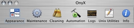
Using Tiger, I’ve gotten used to the somewhat bland, Windowsish look. But the other day I fired up Onyx and was immediately struck by how stunning it looked. Here’s a snapshot:
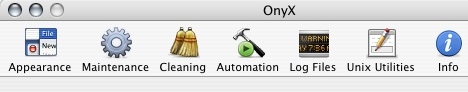
Realising I probably had an old version, I checked and sure enough.. Onyx for Tiger looked like a Tiger app:
I dunno about you, but the Tiger look just doesn’t inspire. And what about this background:

Looks to me like fog or smoke. Hardly classy. And it reminds me a lot of the silver theme in XP.
Whether you liked Brushed Al or not, when someone from the dark side saw it, they knew they were looking at something with a bit of class.
Even if Brushed Al or Aqua aren’t your cuppa tea, we do need to worry that Apple is dumbing it down.
But why are they? Surely there wasn’t that big a backlash against Brushed Al? Is a Brushed Al GUI more processor intensive to manage and display? That is the only reason I can think of Apple going retro with a 2005 interpretation of a 1990s look.
What say ye?
 del.icio.us
 Digg
Digg Facebook
 Slashdot
 StumbleUpon

Comments
I hate to burst you balloon Chris, but I dont particularly care what “skin” the interface uses, as long as it works… which 99.99% of the time it does! That why I use Apple and not “Application has failed, please check you configuration and try again” Windows.
I dont particularly care what “skin” the interface uses, as long as it works…
A good point, but Apple has always had a leg (and an arm, and most of the torso, and most of someone else’s torso…) up on MS design. Apple design certainly deserves some credit for Apple’s resurgence.
Maybe it’s just a case of Apple having spoiled us, but I want my computer to have a distinct identity, different from Windows.
Um, there was a huge backlash against the brushed Al look. There are programs specifically for stripping the brushed metal look from programs such as Safari, for example.
Personally, I don’t see why Apple still refuses to offer an OS-level way of using different skins. The fact that Windows has it, and the fact that Kaleidascope was so popular for the Classic Mac OS and now that APE thing (Shape Shifter?) is really hot, speaks volumes. Hell, even Workbench 1.0 on the Amiga had tweakable colors and an editable cursor built in to the OS.
That’s not to say it wouldn’t be easy to come up with some really crappy skins (I have seen a number of these on Windows machines for sure), and I’m sure this is a concern for Apple (i.e. they don’t want people to think someone’s lame-ass theme is what OS X is all about). But I’ll bet 85% or more of windows desktops use the XP or Classic theme. Most cars on the road are stock, but some people like to put on wings and stickers and mufflers, etc. Some of them look like crap, some of them look pretty damn cool. Either way, folks that do that sort of thing like having the option.
I prefer the GUI look in Tiger over previous OS X releases. It’s clean and simple, a lot like Platinum on OS 8/9. It stays out of the way of what I am working on. It wouldn’t bother me a bit if the brushed metal went away from iPhoto/iDVD/Finder/Safari/et al. But what if someone liked it so much they wanted all apps to have it? I say let them!
“Surely there wasn’t that big a backlash against Brushed Al?”
If you are unaware of how many people hate the Brushed Metal interface design, you shouldn’t be writing this article. Folks have been complaining about it ever since QuickTime 4 and Sherlock 2 on OS 9.
Oh, and Apple has not forsaken Metal. They’re still converting some apps to it: Keychain Access in Tiger is now metal. Makes no sense, but it’s metal now.
Uh, that new skin looks nothig like any Windows skin available on XP, for starters it appears concaved, and has two soft colours and the line between the two colours is also fairly soft. XP in standard uses bold colours with huge contrasts between the window and the “grey area”(actually slightly yellow on XP). The classic skin appers to be made of painted girders.
Apple should just follow their own advice:
You can use a brushed metal window if your application:
• Is a single-window application that provides a source list to navigate information—for example, iTunes or the Finder
* Strives to re-create a familiar physical device—Calculator or DVD Player, for example
* Provides an interface for a digital peripheral, such as a camera, or an interface for managing data shared with digital peripherals—iPhoto or iSync, for example
You should not use a brushed metal window if your application:
• Is a multi-window application—for example, Interface Builder
• Is a document-based application—for example, TextEdit
Use brushed metal window look for the primary application window and other windows that meet the above criteria—for example, the Equalizer window in iTunes. Don’t use it for supporting windows, such as preferences and other dialogs. It is acceptable to have a mix of standard Aqua windows and brushed metal windows within an application, as the Finder does.
Apple’s own advice is so incoherent and hazy that its a shame they even call them Human Interface Guidelines.
An desktop environment in its current incarnation is for better or worse - not just their to “work”. Its akin to the house or apartment you live in. Nothing in your house is perfectly optimized for you to just “work”. There are many things there that provide you pleasure just for being there. Like decorative candles, or a fancy light: a myriad of things that have nothing to do with letting you live in a covered space.
We spend so much time in our virtual desktop environment that Apple and any software developer has a duty to make it enjoyable. Look at Delicious Library: a fantastic examples of how visual and interactive design can not just help you accmplish something better, but more enjoyably.
“We spend so much time in our virtual desktop environment that Apple and any software developer has a duty to make it enjoyable.”
Then they have a duty to toss Brushed Aluminum out and furthermore officially support theming. Because I am heartily sick of Brushed Al, I strongly dislike the new “merged” toolbars, and I wish they’d get rid of Panther-style tabs as well. All that crud should be at the very least optional.